Color has an outsized impact on how a living room feels. The right palette makes a space feel warm, calm, and inviting — while the wrong one can make it feel cold, flat, or visually chaotic. In living room design, selecting a soothing palette that still feels stylish ensures the space supports relaxation, conversation, and everyday comfort.
If you haven’t yet explored how lighting affects mood in the living room, check out Living Room Lighting Ideas That Create Ambience and Function, which provides helpful context on how colors and light interact.
Why Color Matters in Living Room Design
Color influences emotion, perceived space, and how finishes look under natural and artificial light. It can make a room feel larger, warmer, cozier, or more energetic — depending on the tones you choose.
A thoughtful color palette contributes to:
- Visual calm and cohesion
- Perceived light and openness
- Harmony between walls, furniture, and decor
- Emotional comfort and relaxation
Before selecting colors, consider how much natural light your living room receives, the style of your furniture, and the mood you want to support.
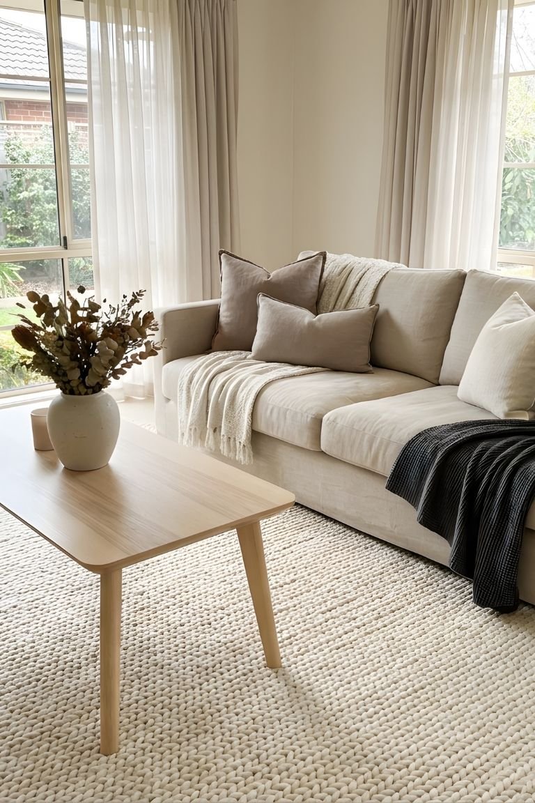
Warm Neutrals: A Foundation for Calm
Warm neutrals are one of the most reliable choices for living room palettes because they feel inviting without being overpowering. These tones create a soothing backdrop that supports layered design and varied textures.
- Warm whites — Soft, reflective, and bright
- Beiges and greiges — Subtle warmth with depth
- Taupes — Cozy without feeling heavy
Warm neutrals work well with both traditional and modern furniture, and they allow accent colors to shine without distraction.
Cool Tones That Still Feel Serene
Cool tones — such as muted blues and soft greens — can feel calming and elegant when used thoughtfully. The key is to choose shades that are muted and paired with warm accents to avoid a chilly or clinical feel.
| Color | Effect | Best Used With |
|---|---|---|
| Muted blue | Serene and grounding | Warm wood tones and soft neutrals |
| Soft sage green | Natural and restful | Beiges, creams, and natural textures |
| Dusty teal | Elegant with depth | Neutral accents and matte finishes |
Cool tones create a sense of openness while still feeling warm and approachable when balanced with complementary accents.
Accent Colors That Add Visual Interest
Accent colors bring personality and dimension without overwhelming the space. The goal is to enhance calm, not distract from it.
- Warm terracotta — Earthy, grounding accents
- Soft coral — Subtle warmth in textiles or artwork
- Muted mustard — Deep but understated contrast
Use accent colors in pillows, throws, small decor, or one feature wall. Too much color can feel busy, so think of accents as a way to gently punctuate the room’s main palette.
Color and Lighting Go Hand in Hand
Before committing to a palette, test large patches of paint under different lighting conditions. Natural light can make colors feel brighter and warmer, while artificial lighting — especially warm bulbs (2700K–3000K) — can shift tones subtly at night.
- Test color samples near windows
- Observe how colors change from day to evening
- Consider ambient, task, and accent lighting when pairing color
Warm light enhances cozy tones and supports a restful, inviting environment.
Create Harmony With Furniture and Finishes
Your color palette should complement furniture tones and finishes. When wall colors, upholstery, and materials work together, the room feels cohesive and calming.
For example:
- Warm neutrals pair beautifully with wood furniture and soft textiles
- Muteds greens and blues blend well with woven or natural textures
- Accent hues in decor should feel intentional, not random
Harmonizing colors with furniture and finishes avoids visual tension and makes the room feel more inviting.
Use Color to Define Zones
In open-plan spaces, color can help define zones — such as a conversation area or reading nook — without adding physical barriers. A slightly different accent wall or deeper shade in one zone creates subtle separation while maintaining overall cohesion.
- One feature wall behind a sofa
- Color shift near built-in shelving or nooks
- Coordinated textiles that echo wall tones
This strategy helps the room feel layered and purposeful rather than flat or one-dimensional.
Balance Bold Choices With Neutral Foundation
If you want a bold color statement, anchor it with a neutral foundation. A strong accent wall, deep-colored furniture, or vibrant textiles can feel stylish when balanced with calming neutrals on larger surfaces.
- Deep navy on an accent wall with warm beige walls overall
- Rich emerald accent chair with soft off-white surroundings
- Terracotta decor with neutral upholstery and wood finishes
This balance prevents bold choices from feeling overwhelming or disconnecting from the room’s overall calm atmosphere.
Final Thoughts
Living room color palettes that promote relaxation and style are rooted in balance — between warm and cool tones, between neutrals and accents, and between form and function. Thoughtful palettes help unify furniture, finishes, lighting, and decor so the space feels cohesive, calm, and visually inviting.
Whether you choose warm neutrals, muted cool hues, or subtle accent touches, the goal is a palette that supports comfort, enhances connection, and creates a living room you genuinely enjoy spending time in.