The colors you choose for your bathroom influence mood, perceived space, and even how lighting interacts with surfaces. A carefully selected palette can make a bathroom feel calm and comforting — whether the space is large or small, minimal or layered with texture.
Bathroom color selection isn’t simply about picking a favorite shade. It involves understanding how color works with light, materials, and your daily routines. For broader planning ideas before diving into colors, check out How to Plan a Bathroom Renovation Without Feeling Overwhelmed, which helps frame your decisions within your lifestyle.
Below, we’ll explore calming palette strategies, combinations that feel comforting, and tips on how to use color in bathrooms of different sizes and lighting conditions.
Why Bathroom Color Matters More Than You Think
Color affects psychological perception and spatial feeling. Certain hues create openness, while others offer warmth or subtle grounding. The goal is to select colors that support the mood you want — whether it’s energizing in the morning or restful at night.
For inspiration on how layout can influence feel, see How Bathroom Layout Impacts Daily Routines and Comfort, which discusses how space and flow relate to daily experience.
Calming Neutral Palettes
Neutral palettes are a reliable foundation for bathrooms because they reflect light subtly and offer flexibility when paired with materials or accents. They’re often used in spa-like environments and can easily support both minimal and warm design schemes.
| Color Group | How It Feels | Where It Works Best |
|---|---|---|
| Warm Whites | Inviting, soft backdrop | Bathrooms with natural light |
| Greige (Grey + Beige) | Balanced calm without stark contrast | Medium-light spaces |
| Soft Taupe | Warm grounding tone | Rooms with layered materials |
| Muted Stone | Earthy and serene | Paired with wood or stone finishes |
Warm neutrals work especially well in spaces where comfort and continuity are priorities. They also pair beautifully with materials like matte stone and wood accents, which help bring depth without feeling busy.
Using Cool Palettes Without Feeling Icy
Cool palettes — such as soft greys, pale blues, or muted greens — can wake up a space and make it feel crisp and clean. The key to keeping cool palettes from feeling too stark is balancing them with warm neutrals or warm lighting.
- Pale blue with sandy neutrals
- Soft grey with warm wood finishes
- Muted green with natural stone accents
For example, pairing pale grey walls with matte stone and warm lighting creates depth and calm rather than a clinical atmosphere. Light-reflective colors help bring brightness to spaces with limited natural light.
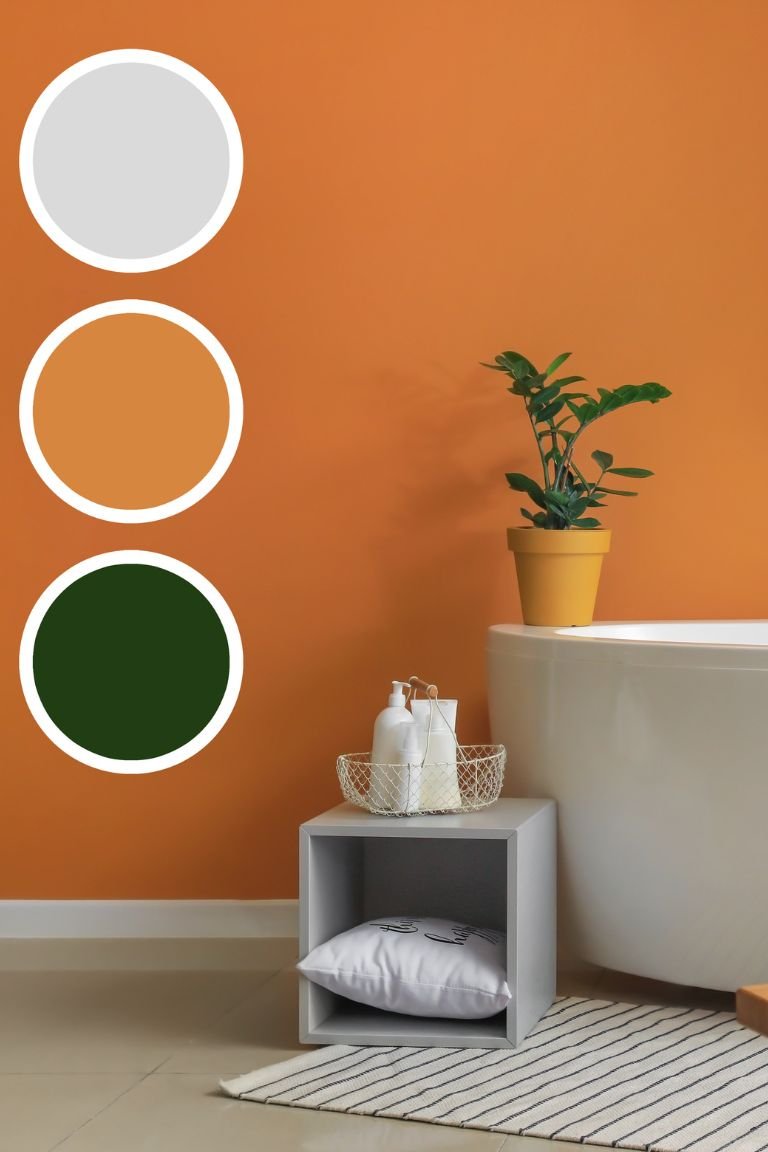
Accent Colors That Add Comfort Without Overpowering
Accent colors can add personality and visual interest, but they’re most effective when used sparingly and with purpose.
| Accent Color | Effect | Best Used With |
|---|---|---|
| Soft Sage Green | Subtle natural calm | Neutral walls and wood accents |
| Warm Terracotta | Earthy warmth | Light neutrals and matte finishes |
| Muted Navy | Deep, grounding contrast | Warm metals (brass, bronze) |
You don’t need a full accent wall to make color work. A towel set, a single painted niche, or a few tiles in an accent shade can create visual depth and harmony without overpowering the palette.
How Light Changes Color Perception
Light — both natural and artificial — plays a huge role in how colors appear in bathrooms. A shade that looks soft and warm in daylight may read colder under LED lighting if the color temperature is too cool.
Layered lighting — ambient, task, and accent — helps control how color feels throughout the day. For more on lighting design principles that support mood and practical use, see Why Bathroom Lighting Matters More Than You Think.
Tips for assessing color in your space:
- Test paint samples on multiple walls
- Observe swatches at different times of day
- Pair color tests with your chosen lighting setup
Palette Strategies for Different Bathroom Types
Not all bathrooms are the same — size, lighting, and materials influence how a color palette plays out in real life.
- Small Bathrooms: Lighter neutrals with minimal contrast help create openness. Consider warm whites or pale greige as a base.
- Bathrooms with Low Natural Light: Reflective light neutrals and subtle cool hues paired with warm artificial lighting help keep the space bright.
- Spacious Bathrooms: You can introduce deeper neutrals or accent colors that ground larger walls without closing in the room.
These strategies make your palette choices feel logical and tailored to how the space feels in daily life, not just how it looks in photos.
Pairing Color With Materials and Finishes
Color doesn’t work in isolation. It interacts with finishes, textures, and materials. Matte finishes, natural stone, woven textiles, and warm metals (like brushed nickel or soft brass) enhance color while supporting sensory comfort.
Pairing a neutral palette with textured tiles, wood cabinetry, or soft textiles adds warmth without overwhelming visual calm. For ideas on materials that age well (making color choices last longer), check out Choosing Bathroom Materials That Age Well Over Time.
Final Thoughts
Bathroom color palettes that create calm and comfort balance light, materials, and daily use patterns. Whether you’re starting with warm neutrals or using cool tones with warm accents, the goal is a space that feels cohesive, restful, and supportive of your routines.
Thoughtful color choices enhance your bathroom’s mood and function — making everyday moments feel more intentional and grounded.