The colors and finishes you choose for your kitchen have a major impact on how the space feels. A calm, inviting palette makes the kitchen feel welcoming and timeless, while the right finishes create harmony between surfaces and daily use needs.
A kitchen with thoughtful colors and finishes feels comfortable to spend time in and supportive of both function and style. Instead of chasing fleeting trends, focus on palettes and materials that feel intentional and enduring.
If you haven’t already explored how materials impact everyday use, Choosing Kitchen Materials That Hold Up to Everyday Use offers valuable guidance on surfaces that are both durable and beautiful.
Why Kitchen Color Choice Matters
Color affects mood, perception of space, and how finishes interact with light. The wrong palette can make a kitchen feel chaotic or cold, while the right one enhances calm and clarity.
When choosing colors for your kitchen, consider:
- How light enters the room
- How finishes reflect or absorb light
- Whether you want the space to feel warm, bright, or grounded
A balanced palette helps the kitchen feel cohesive and supports a welcoming atmosphere — essential for a room that’s at the heart of daily life.
Warm Neutrals: A Timeless Base
Warm neutrals create a calming, adaptable foundation. They pair beautifully with both modern and traditional kitchens and help surfaces feel visually unified.
- Soft beige
- Warm greige (grey + beige)
- Creamy off-white
- Muted taupe
These tones reflect light softly and create a sense of continuity between cabinets, walls, and countertops. When paired with natural wood, stone, or matte finishes, they support a warm, inviting kitchen feel.
Accents That Add Depth Without Overwhelming
Accent colors add visual interest without dominating the space. When used in moderation, they enhance the palette without creating visual noise.
| Accent Color | Effect | Best Paired With |
|---|---|---|
| Soft Sage Green | Subtle natural calm | Warm neutrals and wood tones |
| Muted Navy | Grounded contrast | Light cabinets or stone surfaces |
| Warm Terracotta | Earthy warmth | Neutral bases and brass accents |
Accent tones work well on islands, backsplashes, lower cabinets, or open shelving backs. They support visual interest without overwhelming the simplicity of a calm palette.
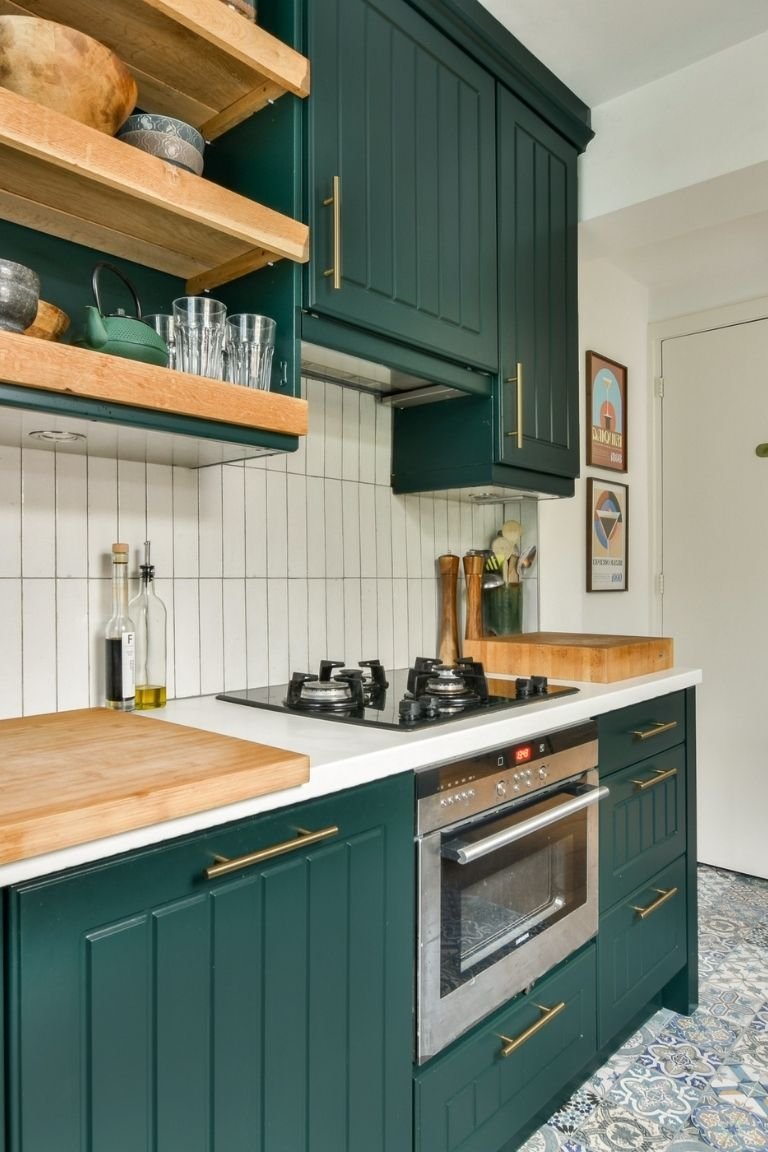
Cabinet Finishes That Feel Calm and Refined
Cabinet color and finish set the tone for the entire kitchen. Choosing finishes that feel cohesive makes the space feel more intentional and inviting.
- Matte finishes: Soft, refined look that hides fingerprints and glare
- Warm wood stains: Adds organic texture and warmth
- Neutral painted cabinets: Timeless and versatile
Matte or satin finishes often feel calmer than high gloss, especially in kitchens with a lot of natural light. They reduce sheen and contribute to a softer, more approachable surface.
Countertops That Complement Your Palette
Countertop color and finish play a huge role in how the kitchen feels. Light surfaces make a space feel open and airy, while medium tones ground the design without feeling heavy.
- Light quartz: Bright and low-maintenance
- Neutral granite: Durable with subtle pattern
- Soapstone or matte stone: Warm texture, understated elegance
When selecting countertop colors, consider how they interact with cabinet tones and backsplashes. A cohesive relationship between these finishes creates a unified, calm visual field.
Backsplashes That Add Subtle Detail
The backsplash is an opportunity to introduce texture and pattern that feels intentional — not busy. Choose materials that echo your overall palette while adding depth.
- Subway tile in warm white or beige: Classic and calm
- Glass tile in muted tones: Adds subtle reflection
- Large-format porcelain: Minimal grout lines, streamlined appearance
Large tiles with minimal grout lines support visual calm by reducing interruption, while subtle textures add dimension without competing with the main color story.
Floor Finishes That Ground the Space
Flooring finishes help define the kitchen’s character and can influence how warm or cool the space feels overall.
| Floor Finish | Why It Works | Pair With |
|---|---|---|
| Warm wood or wood-look tile | Adds organic warmth | Neutral cabinets and warm neutrals |
| Light porcelain tile | Brightens and reflects light | Light countertops and soft accents |
| Patterned encaustic tile | Subtle vintage detail | Neutral palette with muted tones |
Warm wood or wood-look finish creates an inviting foundation, while light porcelain helps reflect natural light. If you choose patterned tile, keep the tones subtle so the pattern enhances rather than overwhelms.
Metal Finishes That Tie It All Together
Metal accents — in lighting, hardware, and fixtures — should coordinate with your kitchen’s palette and finishes.
- Brushed nickel: Soft warmth, minimal shine
- Matte black: Clean contrast, grounded
- Soft brass: Warm metallic touch
Consistent metal finishes throughout the kitchen support visual cohesion and enhance the sense of intentional design. Mixed metals can work if they share a similar tone, but a limited palette usually feels calmer.
Consider Natural vs. Artificial Light
Color and finishes look different under various lighting conditions. Natural light often brings out the warmth in neutrals and woods, while artificial light can shift tones subtly at night.
Layered lighting — ambient, task, and accent — helps maintain a calm feel throughout the day and evening. For lighting ideas that complement color and finishes, check out Kitchen Lighting Ideas That Improve Function and Atmosphere.
Final Thoughts
Choosing kitchen colors and finishes that make the space feel calm and inviting is about creating harmony between surfaces, light, and function. Warm neutrals, thoughtful accents, cohesive metals, and balanced lighting all work together to create a kitchen that feels both welcoming and timeless.
When finishes are intentional and colors support daily life — not just trends — the kitchen becomes not only a functional workspace but a place that feels nourishing, calm, and inviting.